
If you haven’t done so yet, work through this exercise to come up with your brand identity and business name. Once you’ve figured out your brand identity, you have to create a visual identity — also referred to as brand imagery — to go along with it. While you could easily throw together visual elements that speak to you, your goal should be to choose visuals that resonate with your audience. So, building your visual identity is going to require some work. In the following post, we’re going to look at how your brand’s visual style can give off certain signals to those who encounter it (and how to use those to your advantage). We’ll also break down what you need, to piece together your visual identity. The Power of Visual IdentityEach of the design choices you make that website visitors, social media followers, and customers can see will impact how they approach your brand. Are you a fun-loving company that caters to a younger crowd? Do you create high-tech products that solve serious global problems? Are you a successful entrepreneur who’s reshaping the way we talk to one another? When done right, our brand visuals convey our brand’s personality, values, and mission without having to use any words. Think about your favorite clothing brand. What do you picture? Let’s use Athleta as an example. The logo is probably the first visual element that comes to my mind:
The grey radial shape is one I’m very familiar with. It’s on their website, their social media, and it’s usually imprinted somewhere on their clothing. The second thing I think about when I think of Athleta is its physical imagery:
Rather than include images of the clothing on its own, there’s often someone wearing Athleta clothes while hiking along a trail, walking on a beach, or working out in a studio. There’s so much that just these two visual elements tell us about this brand:
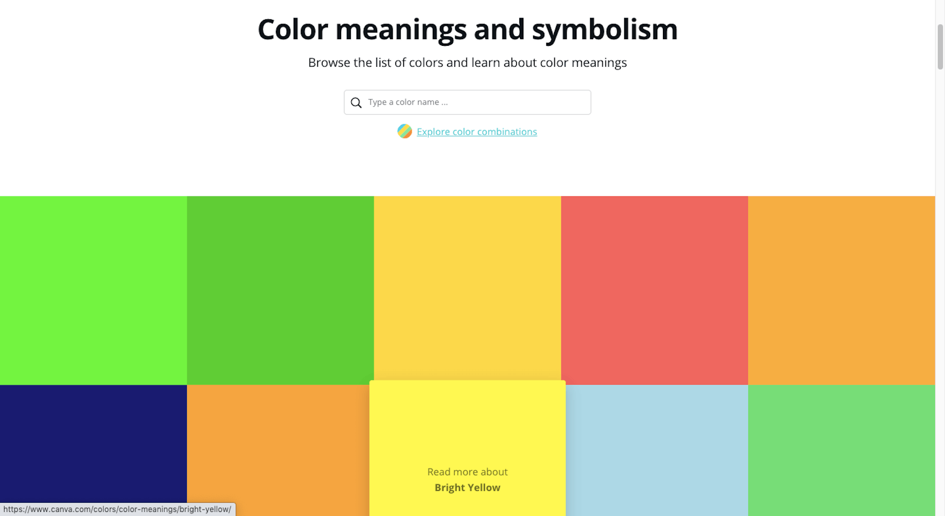
There are overt ways to use visuals in your branding (usually through your choice of photos or illustrations). But there are also ways to subtly convey more about your company, what it does, and for whom you work through your choice of colors, fonts, structure, and more. How to Create a Visual Identity for Your BrandLet’s walk through each of the elements you need to pull together to create your visual identity: The Color PaletteLike with everything else in business, you’re here to give your audience something they need, so they have to be at the forefront of your decisions — including which colors you put into your brand’s palette. So, where do you start in choosing a color palette for your site and other marketing channels? Let’s take a systematic approach. 1. Choose a Primary Color Go to the Canva color meanings and symbolism tool.
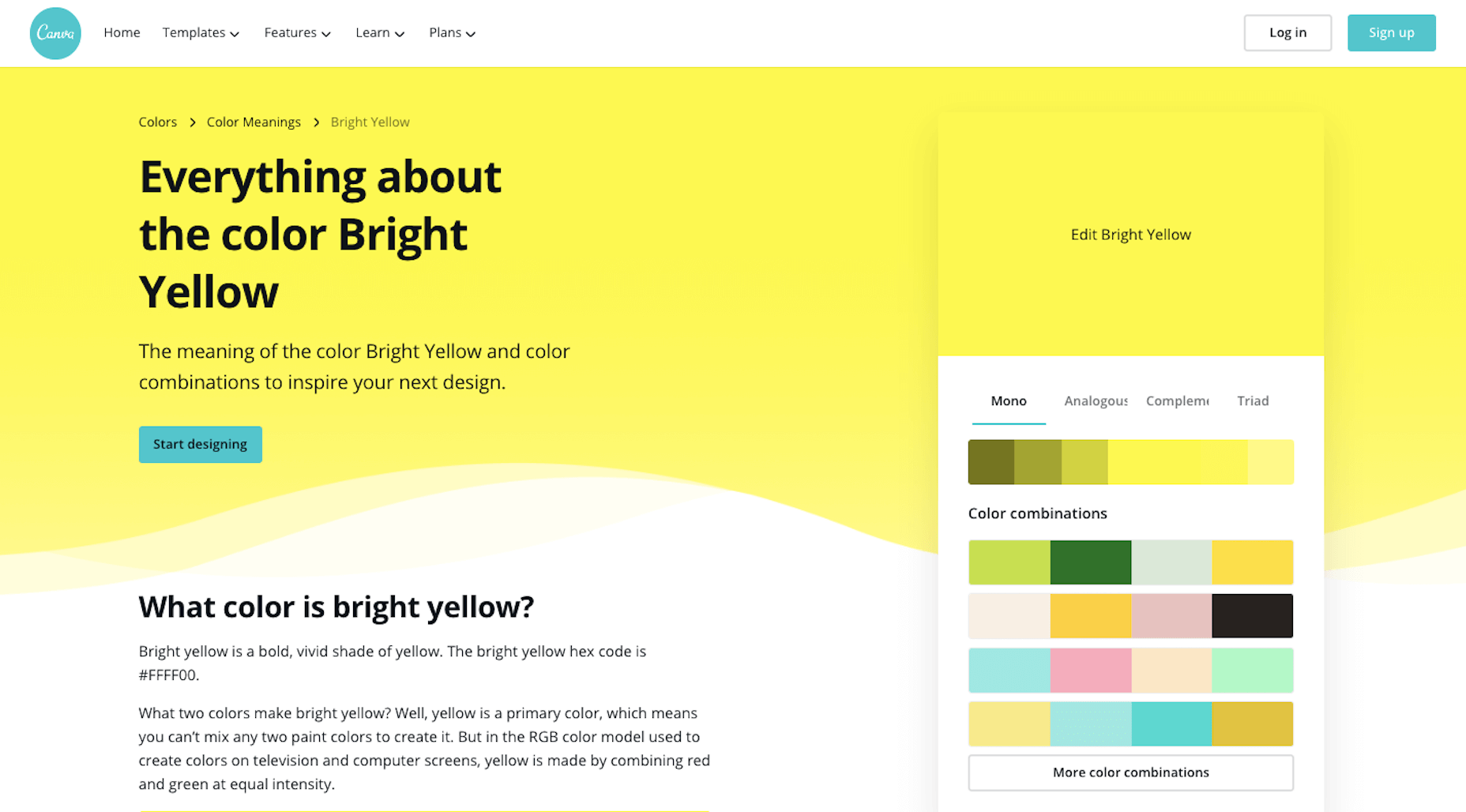
Have a look through the colors and find one that feels good to you. Open up the page and read more about what the color means:
You’ll find the following on each page:
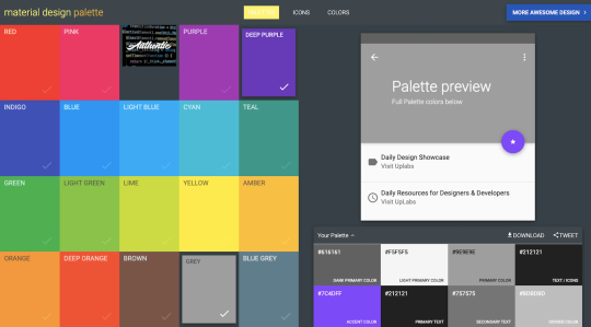
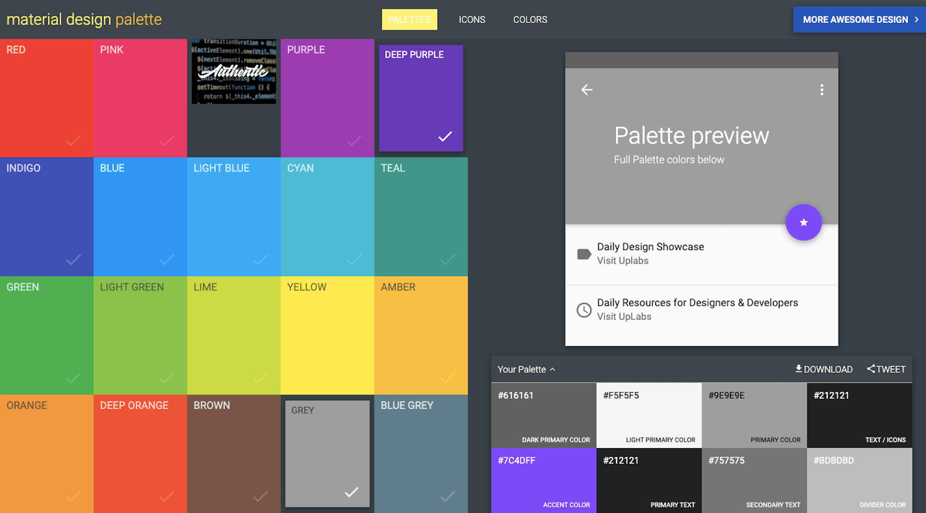
While it’s important to consider how colors evoke different emotions, it shouldn’t be the only driving force. Your primary focus should be to choose colors that positively affect the user experience. In other words, you don’t want them to get in the way or distract prospects from getting to know your brand and eventually converting. 2. Create a Full Color Palette Once you’ve picked a primary color, you need to come up with a color palette. You’ll want one or two colors to use in your logo and a full color palette for your website and other branded channels. You can use Canva’s palette suggestions (in the top-right corner of the color page) to create a basic color palette. For something a little more robust, use Material Design Palette:
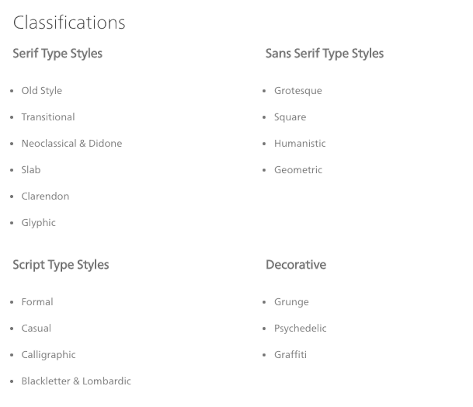
Color options are a bit limited, but it does a good job of spelling out where you should use each color. You can then adjust the color palette as you see fit. TypographyThe design and pairing of your fonts can greatly impact the way people respond to your brand and the words you’ve written about it. So, the goal with typography is to make your words easy to read while also giving hints about your company’s personality and style. 1. Understand Font Styles Figure out what style of font goes best with your brand identity. This is the simplest way to categorize fonts:
You can break these down even further and really get to the root of the style. Fonts.com has a great explainer page on each of these classifications:
Here are some sources to help you find fonts for your brand: 2. Settle on Two or Three Fonts Choose two or three fonts for your brand. Max. Anything more than that will create a distracting and overwhelming interface for your audience. You’ll need:
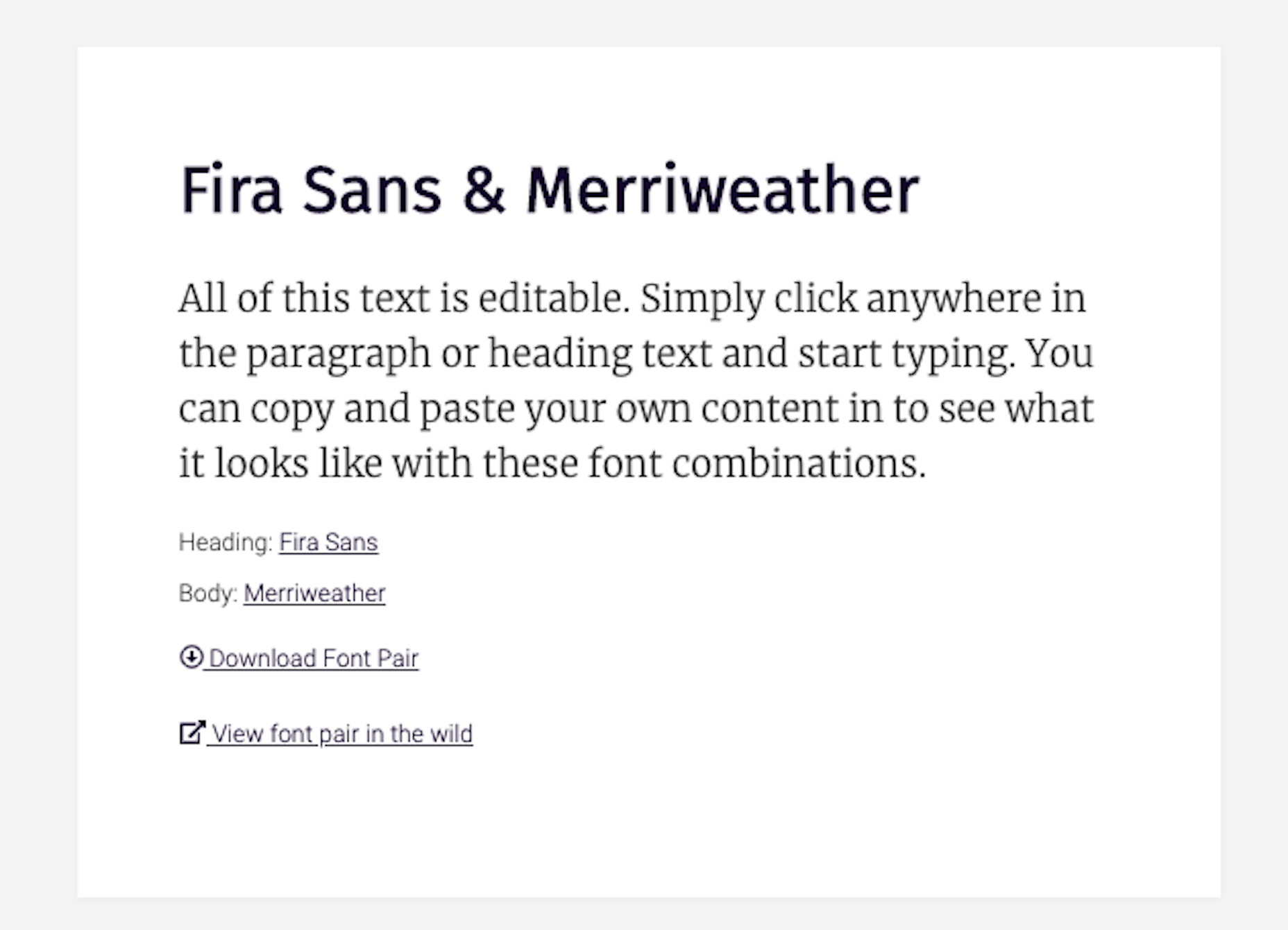
If you find that you need more variety in your fonts to create a clearer hierarchy on the page or to call out certain elements, use superfamilies with dozens or even over a hundred different styles. That way, your users’ eyes won’t get fatigued from having to switch between too many font types. 3. Learn Font Pairing Rules To pair fonts, use styles that contrast yet complement one another. Ultimately, you want the pairing of your fonts to send a cohesive message to your audience. For example, a sans serif header and serif body are a common way to combine fonts. Like this pairing of Fira Sans and Merriweather from the FontPair website:
This modern-looking duo sends the message that: “Your comfort is priority #1 for us. Take your time reading and enjoy.” There are tons of ways to make varying styles play off one another while sending the right signals to your audience: A safe serif with a retro cursive header font to come off as a playful, yet professional brand; a futuristic header and a neutral sans serif body font to give your product pages a very techy feel; and so on… Once you have one or two fonts you like the vibe of, use FontPair to track down a good complement to the one you want to use. ImageryWe can use this as a blanket category for any visual content you might use in your branding:
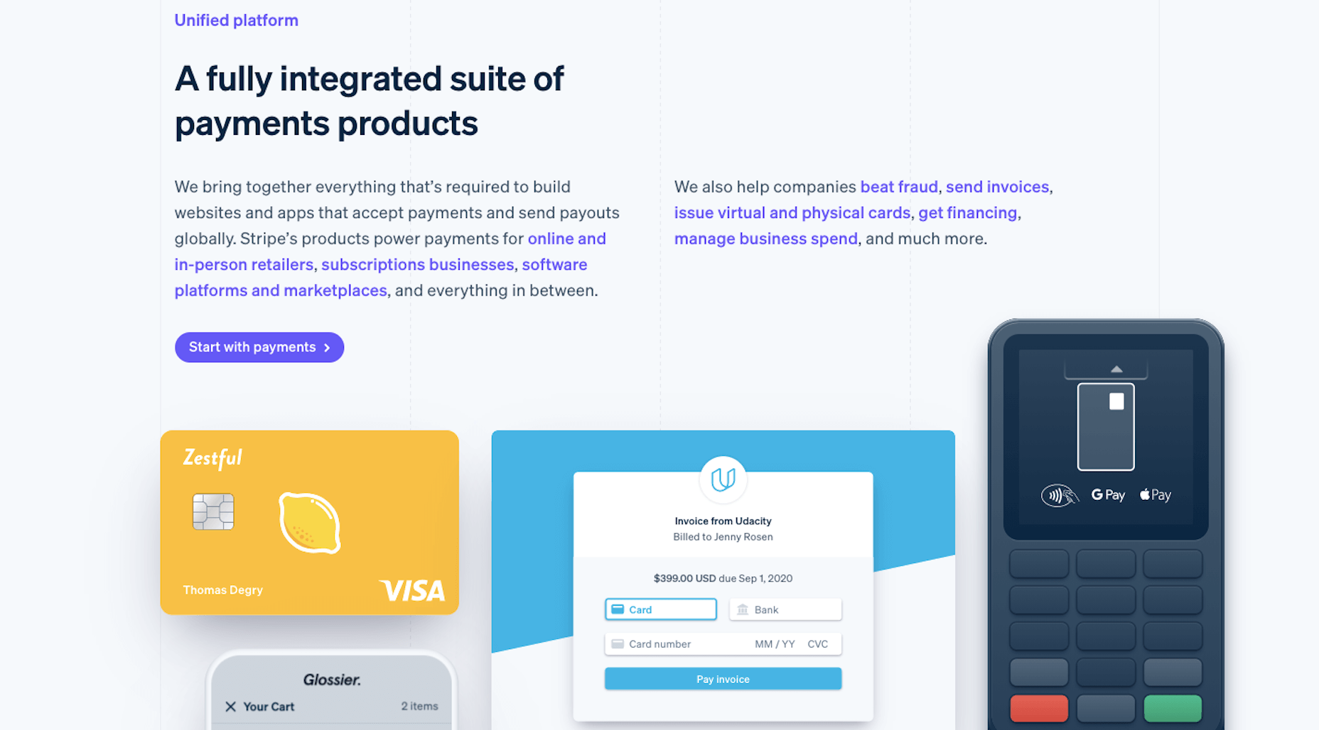
But just because there’s all this content to use, that doesn’t mean it should all appear on the same site to represent the same brand. You’ll want to narrow it down based on your company’s personality and how the style of imagery fits with it. 1. Photos vs. Illustrations You can alter your brand’s voice and style based on the kind of imagery you use. For instance, tech companies like Stripe often use illustration in their brand designs:
Even though SaaS companies sell one type of product, their audiences are usually quite vast, so it would be hard to find photos that represent everyone. And it’s not like users are focused on their relationships with the people behind the scenes. These companies put technology into the hands of their users, so it’s best to let the product shine and not the people. This opens up the door for some fun and creative possibilities with illustrations. That said, choosing photos over illustrations doesn’t completely bar you from using vector graphics and icons. You can mix-and-match those visuals so long as they blend well with one another. What you don’t want to do is to mix two very different styles that say different things about your brand at once. To decide what’s best for your brand, approach this from your users’ point-of-view. What kind of visuals will help them connect to your brand and what you sell? 2. Style It’s not just the type of image you use that impacts your brand identity. It’s the style you apply to those visuals that can transform your visuals, putting visitors in a different time, place, or headspace. Will you apply a filter to give your photos a similar look and feel? Will you place each of your product photos against the same backdrop for a uniform look? Will you use a completely new style of imagery for one of your product lines the way Apple has done for the iPhone 12?
There’s nothing wrong with using out-of-the-box imagery. However, if they don’t give off quite the right tone, don’t be afraid to use your design skills to make adjustments and cater them to your own style. LogoYour logo is the last of the visual elements you’ll need to invest some time in. The good news is that you’ve already done most of the legwork:
That’s really all you need to create a logo that is relevant, unique, attractive, potent, and memorable. That and a way to bring it all together. You have a few options. Option #1: If you’re a graphic designer, you can create your own from-scratch. Option #2: If you want help getting started, you can use a tool like Wix Logo Maker:
You’ll fill out a short questionnaire and then receive dozens of pre-made logos to start with. You’ll later have the chance to customize the design to your liking. Option #3: You can hire someone to design a totally custom logo. Wrapping UpIn the next post in this three-part series, we’re going to look at the next step: Getting your business online. We’ll take everything you’ve done so far in coming up with a business name, brand identity, and now visual identity, and put it towards your website and the marketing channels that are best for your business. SourceThis content was first posted here: Branding 101: Creating the Visual Identity for Your Business via Tumblr Branding 101: Creating the Visual Identity for Your Business
0 Comments
If you haven’t done so yet, work through this exercise to come up with your brand identity and business name. Once you’ve figured out your brand identity, you have to create a visual identity — also referred to as brand imagery — to go along with it. While you could easily throw together visual elements that speak to you, your goal should be to choose visuals that resonate with your audience. So, building your visual identity is going to require some work. In the following post, we’re going to look at how your brand’s visual style can give off certain signals to those who encounter it (and how to use those to your advantage). We’ll also break down what you need, to piece together your visual identity. The Power of Visual IdentityEach of the design choices you make that website visitors, social media followers, and customers can see will impact how they approach your brand. Are you a fun-loving company that caters to a younger crowd? Do you create high-tech products that solve serious global problems? Are you a successful entrepreneur who’s reshaping the way we talk to one another? When done right, our brand visuals convey our brand’s personality, values, and mission without having to use any words. Think about your favorite clothing brand. What do you picture? Let’s use Athleta as an example. The logo is probably the first visual element that comes to my mind:
The grey radial shape is one I’m very familiar with. It’s on their website, their social media, and it’s usually imprinted somewhere on their clothing. The second thing I think about when I think of Athleta is its physical imagery:
Rather than include images of the clothing on its own, there’s often someone wearing Athleta clothes while hiking along a trail, walking on a beach, or working out in a studio. There’s so much that just these two visual elements tell us about this brand:
There are overt ways to use visuals in your branding (usually through your choice of photos or illustrations). But there are also ways to subtly convey more about your company, what it does, and for whom you work through your choice of colors, fonts, structure, and more. How to Create a Visual Identity for Your BrandLet’s walk through each of the elements you need to pull together to create your visual identity: The Color PaletteLike with everything else in business, you’re here to give your audience something they need, so they have to be at the forefront of your decisions — including which colors you put into your brand’s palette. So, where do you start in choosing a color palette for your site and other marketing channels? Let’s take a systematic approach. 1. Choose a Primary Color Go to the Canva color meanings and symbolism tool.
Have a look through the colors and find one that feels good to you. Open up the page and read more about what the color means:
You’ll find the following on each page:
While it’s important to consider how colors evoke different emotions, it shouldn’t be the only driving force. Your primary focus should be to choose colors that positively affect the user experience. In other words, you don’t want them to get in the way or distract prospects from getting to know your brand and eventually converting. 2. Create a Full Color Palette Once you’ve picked a primary color, you need to come up with a color palette. You’ll want one or two colors to use in your logo and a full color palette for your website and other branded channels. You can use Canva’s palette suggestions (in the top-right corner of the color page) to create a basic color palette. For something a little more robust, use Material Design Palette:
Color options are a bit limited, but it does a good job of spelling out where you should use each color. You can then adjust the color palette as you see fit. TypographyThe design and pairing of your fonts can greatly impact the way people respond to your brand and the words you’ve written about it. So, the goal with typography is to make your words easy to read while also giving hints about your company’s personality and style. 1. Understand Font Styles Figure out what style of font goes best with your brand identity. This is the simplest way to categorize fonts:
You can break these down even further and really get to the root of the style. Fonts.com has a great explainer page on each of these classifications:
Here are some sources to help you find fonts for your brand: 2. Settle on Two or Three Fonts Choose two or three fonts for your brand. Max. Anything more than that will create a distracting and overwhelming interface for your audience. You’ll need:
If you find that you need more variety in your fonts to create a clearer hierarchy on the page or to call out certain elements, use superfamilies with dozens or even over a hundred different styles. That way, your users’ eyes won’t get fatigued from having to switch between too many font types. 3. Learn Font Pairing Rules To pair fonts, use styles that contrast yet complement one another. Ultimately, you want the pairing of your fonts to send a cohesive message to your audience. For example, a sans serif header and serif body are a common way to combine fonts. Like this pairing of Fira Sans and Merriweather from the FontPair website:
This modern-looking duo sends the message that: “Your comfort is priority #1 for us. Take your time reading and enjoy.” There are tons of ways to make varying styles play off one another while sending the right signals to your audience: A safe serif with a retro cursive header font to come off as a playful, yet professional brand; a futuristic header and a neutral sans serif body font to give your product pages a very techy feel; and so on… Once you have one or two fonts you like the vibe of, use FontPair to track down a good complement to the one you want to use. ImageryWe can use this as a blanket category for any visual content you might use in your branding:
But just because there’s all this content to use, that doesn’t mean it should all appear on the same site to represent the same brand. You’ll want to narrow it down based on your company’s personality and how the style of imagery fits with it. 1. Photos vs. Illustrations You can alter your brand’s voice and style based on the kind of imagery you use. For instance, tech companies like Stripe often use illustration in their brand designs:
Even though SaaS companies sell one type of product, their audiences are usually quite vast, so it would be hard to find photos that represent everyone. And it’s not like users are focused on their relationships with the people behind the scenes. These companies put technology into the hands of their users, so it’s best to let the product shine and not the people. This opens up the door for some fun and creative possibilities with illustrations. That said, choosing photos over illustrations doesn’t completely bar you from using vector graphics and icons. You can mix-and-match those visuals so long as they blend well with one another. What you don’t want to do is to mix two very different styles that say different things about your brand at once. To decide what’s best for your brand, approach this from your users’ point-of-view. What kind of visuals will help them connect to your brand and what you sell? 2. Style It’s not just the type of image you use that impacts your brand identity. It’s the style you apply to those visuals that can transform your visuals, putting visitors in a different time, place, or headspace. Will you apply a filter to give your photos a similar look and feel? Will you place each of your product photos against the same backdrop for a uniform look? Will you use a completely new style of imagery for one of your product lines the way Apple has done for the iPhone 12?
There’s nothing wrong with using out-of-the-box imagery. However, if they don’t give off quite the right tone, don’t be afraid to use your design skills to make adjustments and cater them to your own style. LogoYour logo is the last of the visual elements you’ll need to invest some time in. The good news is that you’ve already done most of the legwork:
That’s really all you need to create a logo that is relevant, unique, attractive, potent, and memorable. That and a way to bring it all together. You have a few options. Option #1: If you’re a graphic designer, you can create your own from-scratch. Option #2: If you want help getting started, you can use a tool like Wix Logo Maker:
You’ll fill out a short questionnaire and then receive dozens of pre-made logos to start with. You’ll later have the chance to customize the design to your liking. Option #3: You can hire someone to design a totally custom logo. Wrapping UpIn the next post in this three-part series, we’re going to look at the next step: Getting your business online. We’ll take everything you’ve done so far in coming up with a business name, brand identity, and now visual identity, and put it towards your website and the marketing channels that are best for your business. SourceThis content was first posted here: Branding 101: Creating the Visual Identity for Your Business via Blogger Branding 101: Creating the Visual Identity for Your Business 
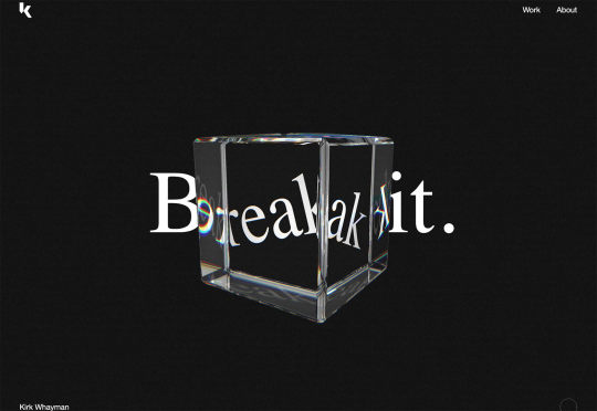
With that being said, there are plenty of holiday flourishes already showing up on many websites. But there are still a few trends that don’t have a holiday theme. Here’s what’s trending in design this month. 1. Beautiful ConnectivityWeb elements that merge and flow into one another can be difficult to design but the payoff is totally worthwhile. This website design trend exemplifies connected elements in a way that’s beautiful and mesmerizing. You can accomplish it with static elements or interactivity; the common theme is that design parts enter the space of one another and merge in ways that are seamless and visually interesting. The thing that makes it exceptionally tricky is responsiveness. To ensure that pieces work well at all sizes when they overlap or encroach on the space of one another takes a lot of planning and testing. Here are a few examples of projects that do it well – and each one does it in a different way. Kirk Whayman’s website uses a floating ice cube over simple lettering. The interactivity is spot on here with hover actions that allow you to move the block with the letters refracting in an expected manner. (It would be easy to play with it all day.) But the coolest interaction happens when you “break it” (click on the cube). The elements continue to merge and interact in a new and different way.
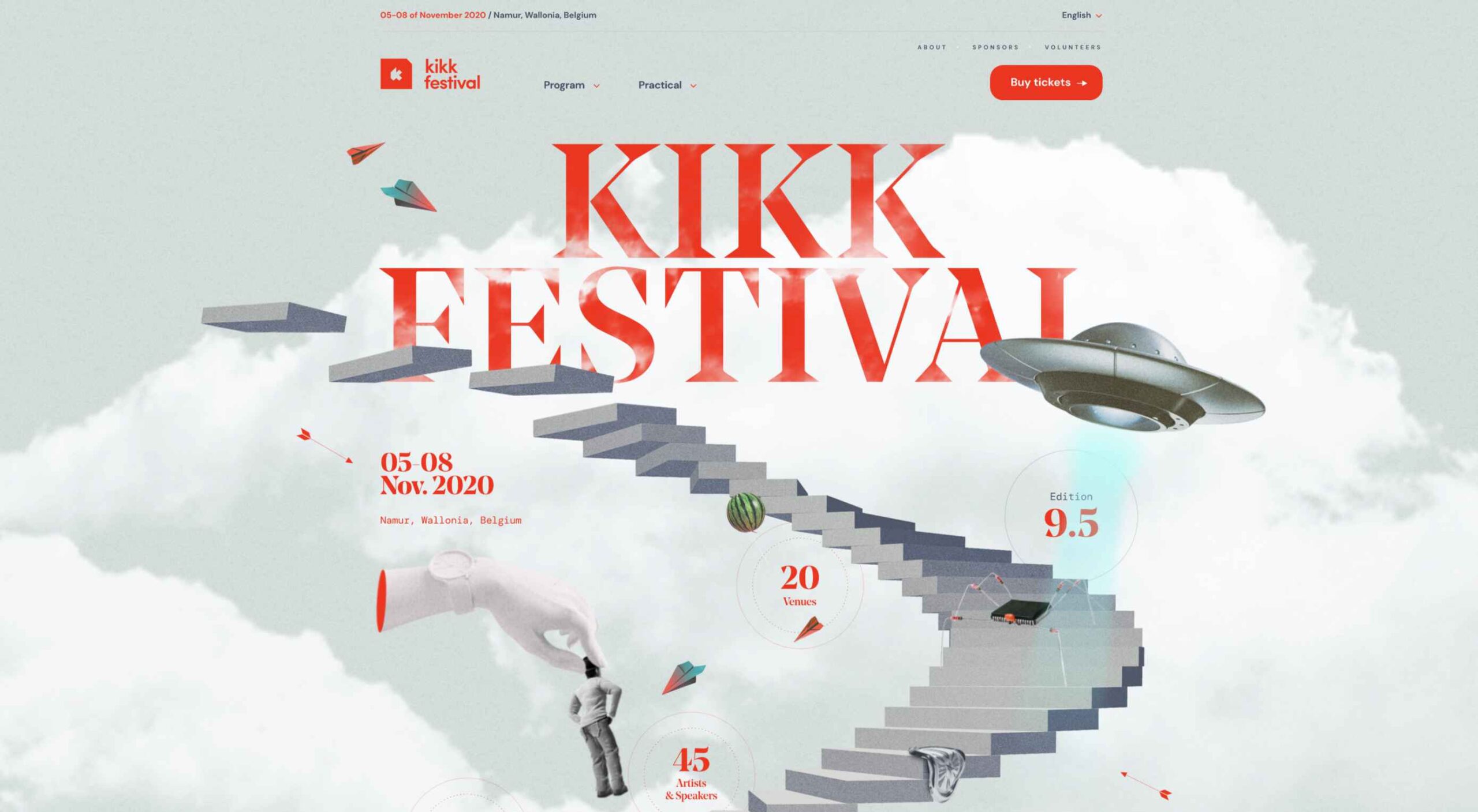
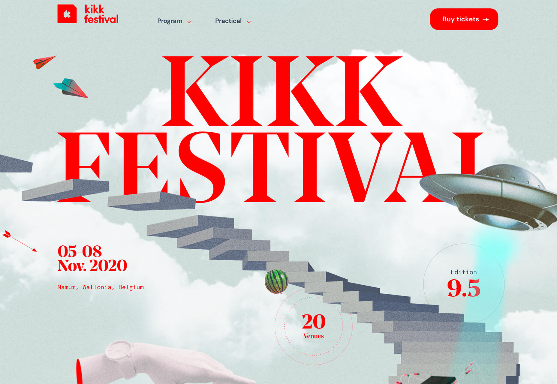
Kikk Festival uses animations and giant scrollable illustrations and plenty of elements that overlap within the space. What’s neat is that everything on this canvas seems to touch everything else. The staircase design encourages scrolling and lettering and smaller animated elements all connect to the steps in the sky motif.
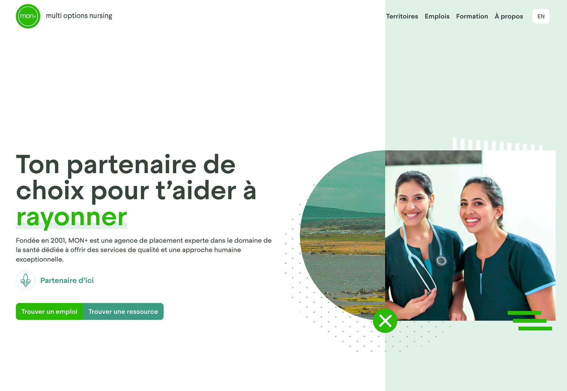
Multi Options Nursing takes a totally different approach. It uses a static split screen with a photo on the right side that merges into a round graphic element. It takes two not-s-interesting images and makes something out of them. The design carries this theme below the scroll as well and this style of image presentation carries a nice visual weight without feeling heavy.
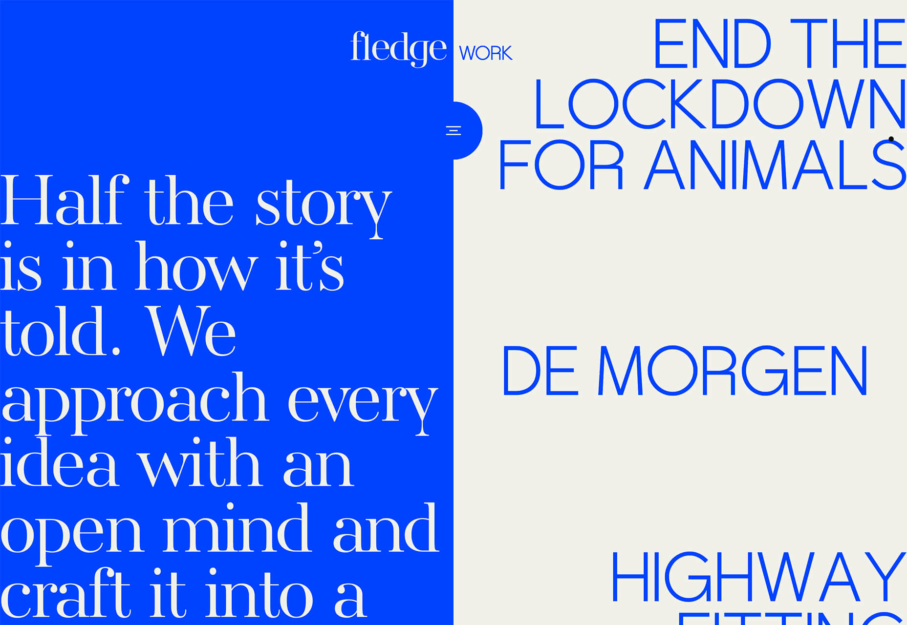
2. Almost BrutalismBrutalism just seems to keep coming back around. For those that love this trend, it keeps evolving as well. The latest styles of brutalism are a little less mono but still pretty sharp with harsh lines, questionable type readability, and a lot going on in a compressed space. These projects also seem to be embracing color and alternative font choices more readily. Fledge uses a split screen – still a dominant trend two years running – with a blue that’s almost too bright with an almost white offset color. The text is big and smooshed into the space tightly. Depending on the breakpoint, you might not even get the whole phrase on the left side. The design challenge is what are you supposed to do here? There are some hover animation cues, but they aren’t very direct.
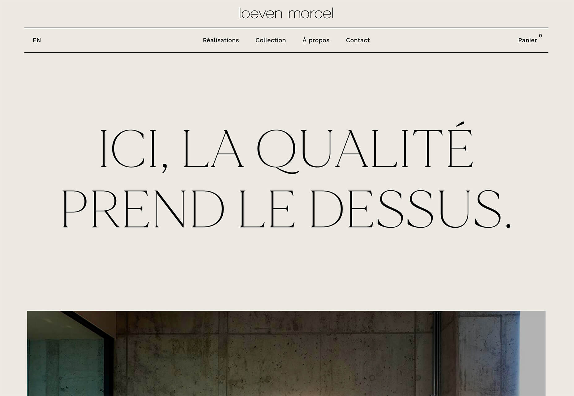
Loeven Morcel’s design has hints of brutalism and elements of elegance. What makes this design skew toward the brutal side is use of space and typography. Like the previous example, it falls into the territory of “what should I do here” with some concerns about readability. Most of these issues are resolved on the scroll if you move beyond the homepage.
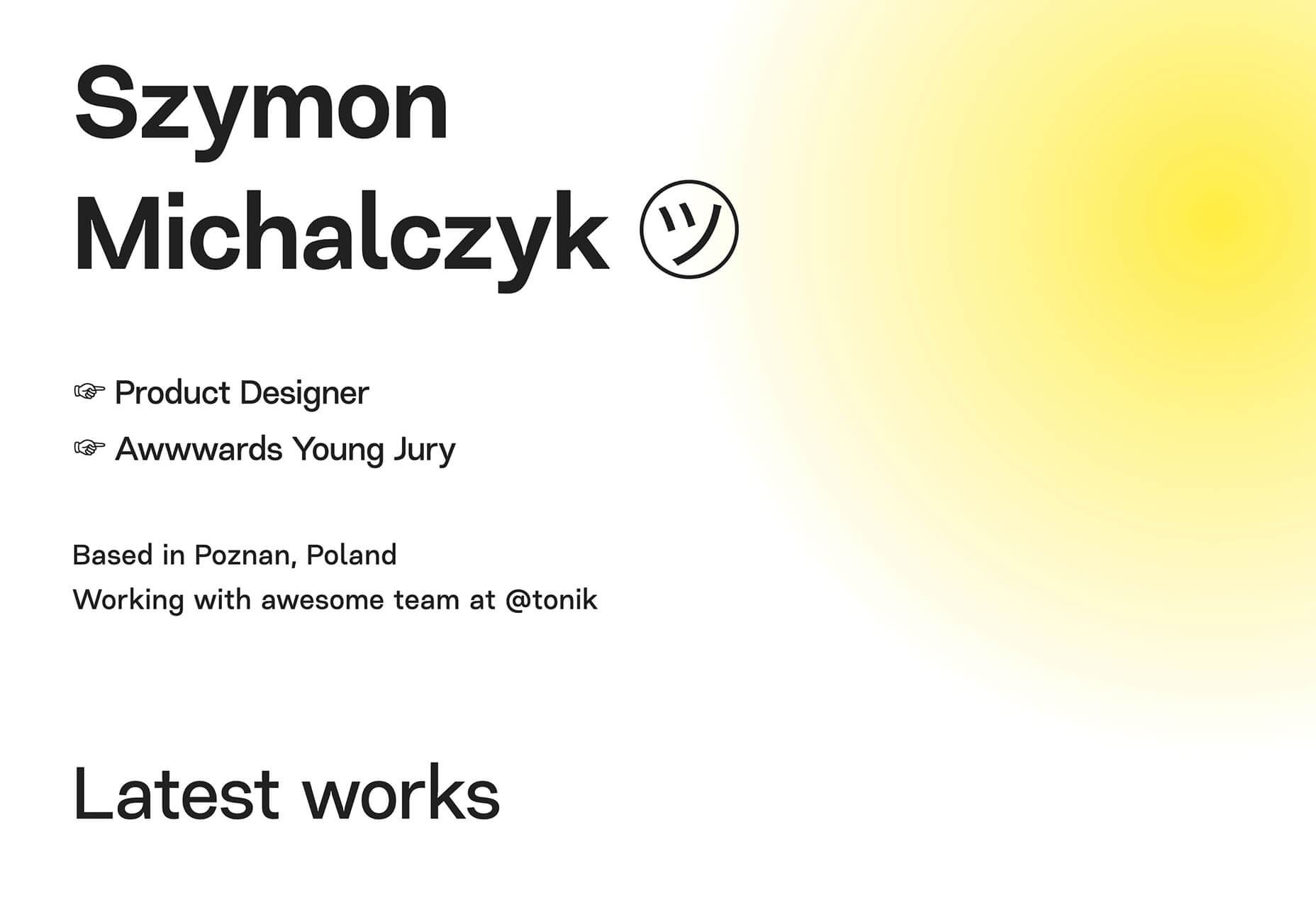
Szymon Michalczyl’s site is another that is close to brutal in style but has an element of sleekness that doesn’t quite carry it over the edge. The simple framework has that brutalist feel but the use of simple, clean fonts with plenty of space pulls it back into a more mainstream design scheme.
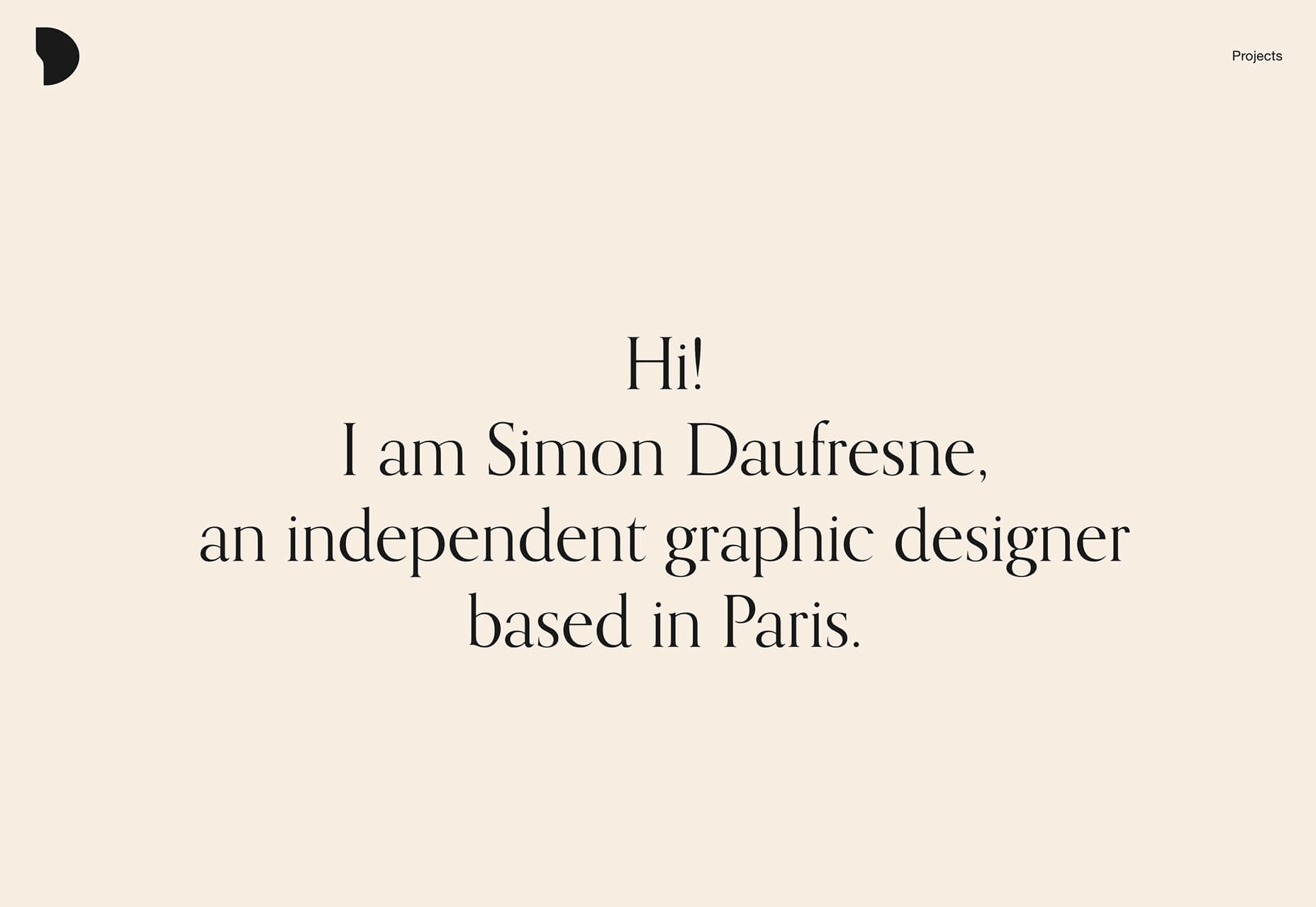
3. Beige EverythingIs a shade of beige the color of the year for 2020? Or is it just how we all feel? Beige backgrounds are everywhere, making this one of those design trends that you can’t miss. The good news is that designers are playing with different shades of beige as well as warm and cool variations. Beige on its own can take on some of the color from accent hues and imagery, so that’s important to keep in mind when using this in the background. The other variable is how saturated to make beige coloring. Most designs are using some of the more muted options while mostly playing with the levels of green and red. But darker beiges are also an option. Simon Daufresne uses a beige that is the color that comes to mind when you think beige. It’s simple, a hint reddish, and is used with black only to maintain true color.
Discovered Wildfoods uses a more neutral feeling beige with a more green undertone (or is that color feel coming from other design elements). The neutral and natural color fits the brand and association this website is trying to create.
Aebele Interiors also uses a more traditional beige but with a bold mustard accent that makes the color feel exceptionally warm. What’s nice about this color combination is that in small sizes the mustard colored-type almost falls into the beige background, but at larger sizes seems to almost jump off the screen. It’s an interesting color juxtaposition.
ConclusionPersonally, this month’s trends are a mixed bag. I love the lines and interactivity of the beautifully connected examples. It shows that elements can cross and work together well. On the flip side, brutalism and beige just aren’t my style. But apparently, they appeal to a lot of people based on the number of projects using these styles. What do you think? I’d love to know how you feel about these trends. Let me know on Twitter. SourceThis content was first posted here: 3 Essential Design Trends, November 2020 via Tumblr 3 Essential Design Trends, November 2020
With that being said, there are plenty of holiday flourishes already showing up on many websites. But there are still a few trends that don’t have a holiday theme. Here’s what’s trending in design this month. 1. Beautiful ConnectivityWeb elements that merge and flow into one another can be difficult to design but the payoff is totally worthwhile. This website design trend exemplifies connected elements in a way that’s beautiful and mesmerizing. You can accomplish it with static elements or interactivity; the common theme is that design parts enter the space of one another and merge in ways that are seamless and visually interesting. The thing that makes it exceptionally tricky is responsiveness. To ensure that pieces work well at all sizes when they overlap or encroach on the space of one another takes a lot of planning and testing. Here are a few examples of projects that do it well – and each one does it in a different way. Kirk Whayman’s website uses a floating ice cube over simple lettering. The interactivity is spot on here with hover actions that allow you to move the block with the letters refracting in an expected manner. (It would be easy to play with it all day.) But the coolest interaction happens when you “break it” (click on the cube). The elements continue to merge and interact in a new and different way.
Kikk Festival uses animations and giant scrollable illustrations and plenty of elements that overlap within the space. What’s neat is that everything on this canvas seems to touch everything else. The staircase design encourages scrolling and lettering and smaller animated elements all connect to the steps in the sky motif.
Multi Options Nursing takes a totally different approach. It uses a static split screen with a photo on the right side that merges into a round graphic element. It takes two not-s-interesting images and makes something out of them. The design carries this theme below the scroll as well and this style of image presentation carries a nice visual weight without feeling heavy.
2. Almost BrutalismBrutalism just seems to keep coming back around. For those that love this trend, it keeps evolving as well. The latest styles of brutalism are a little less mono but still pretty sharp with harsh lines, questionable type readability, and a lot going on in a compressed space. These projects also seem to be embracing color and alternative font choices more readily. Fledge uses a split screen – still a dominant trend two years running – with a blue that’s almost too bright with an almost white offset color. The text is big and smooshed into the space tightly. Depending on the breakpoint, you might not even get the whole phrase on the left side. The design challenge is what are you supposed to do here? There are some hover animation cues, but they aren’t very direct.
Loeven Morcel’s design has hints of brutalism and elements of elegance. What makes this design skew toward the brutal side is use of space and typography. Like the previous example, it falls into the territory of “what should I do here” with some concerns about readability. Most of these issues are resolved on the scroll if you move beyond the homepage.
Szymon Michalczyl’s site is another that is close to brutal in style but has an element of sleekness that doesn’t quite carry it over the edge. The simple framework has that brutalist feel but the use of simple, clean fonts with plenty of space pulls it back into a more mainstream design scheme.
3. Beige EverythingIs a shade of beige the color of the year for 2020? Or is it just how we all feel? Beige backgrounds are everywhere, making this one of those design trends that you can’t miss. The good news is that designers are playing with different shades of beige as well as warm and cool variations. Beige on its own can take on some of the color from accent hues and imagery, so that’s important to keep in mind when using this in the background. The other variable is how saturated to make beige coloring. Most designs are using some of the more muted options while mostly playing with the levels of green and red. But darker beiges are also an option. Simon Daufresne uses a beige that is the color that comes to mind when you think beige. It’s simple, a hint reddish, and is used with black only to maintain true color.
Discovered Wildfoods uses a more neutral feeling beige with a more green undertone (or is that color feel coming from other design elements). The neutral and natural color fits the brand and association this website is trying to create.
Aebele Interiors also uses a more traditional beige but with a bold mustard accent that makes the color feel exceptionally warm. What’s nice about this color combination is that in small sizes the mustard colored-type almost falls into the beige background, but at larger sizes seems to almost jump off the screen. It’s an interesting color juxtaposition.
ConclusionPersonally, this month’s trends are a mixed bag. I love the lines and interactivity of the beautifully connected examples. It shows that elements can cross and work together well. On the flip side, brutalism and beige just aren’t my style. But apparently, they appeal to a lot of people based on the number of projects using these styles. What do you think? I’d love to know how you feel about these trends. Let me know on Twitter. SourceThis content was first posted here: 3 Essential Design Trends, November 2020 via Blogger 3 Essential Design Trends, November 2020
The best way to keep track of all the great stories and news being posted is simply to check out the Webdesigner News site, however, in case you missed some here’s a quick and useful compilation of the most popular designer news that we curated from the past week. Minimal CSS Frameworks
Responsive Grid Design: Ultimate Guide
The New Facebook Design Sucks
The No-Code Generation is Arriving
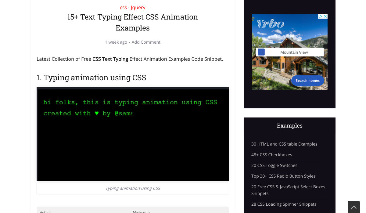
15+ Text Typing Effect CSS Animation Examples
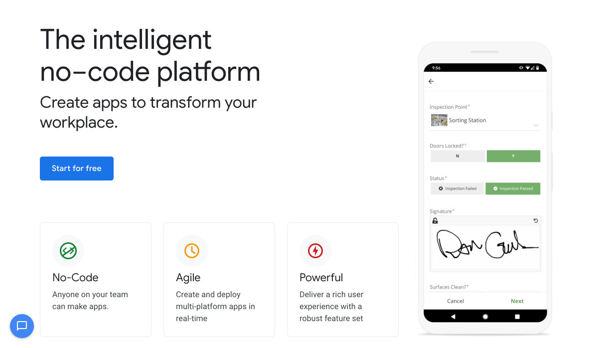
AppSheet by Google Workspace – No-code App Building Platform
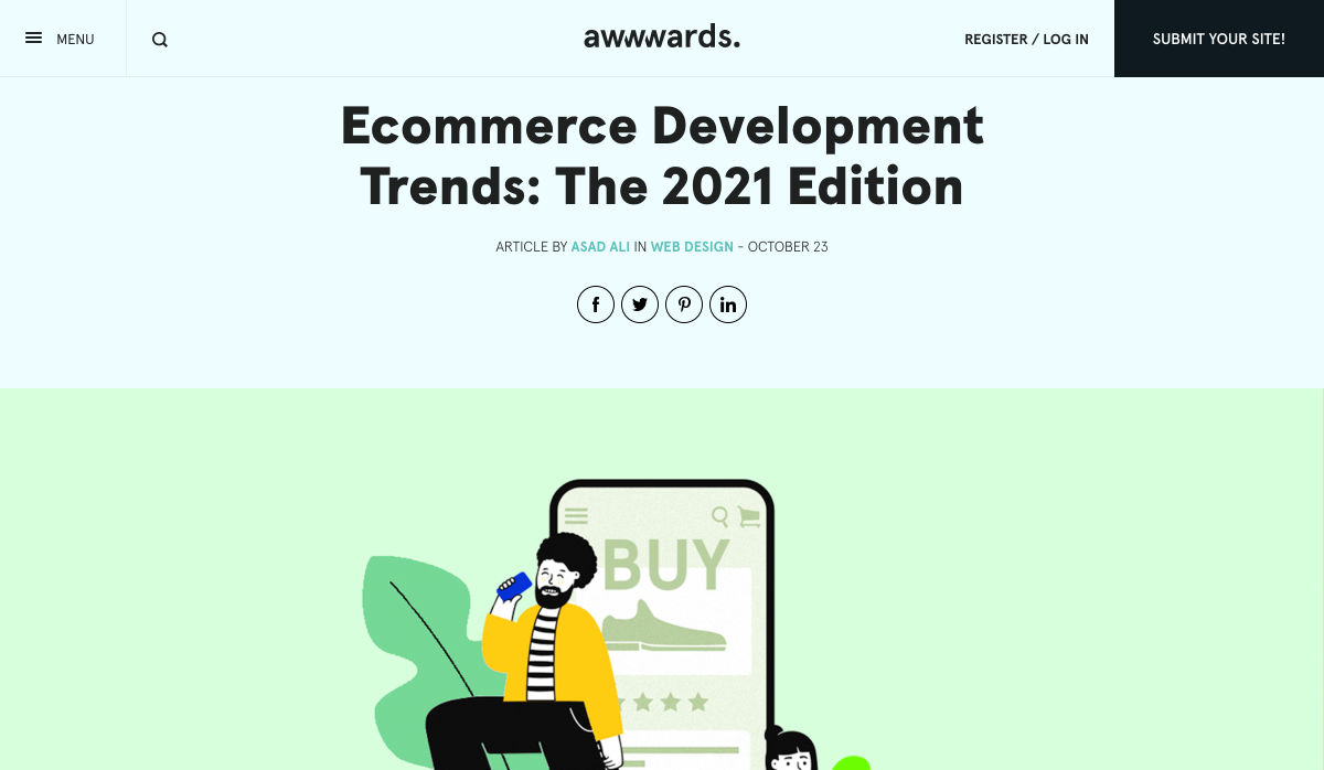
Ecommerce Development Trends: The 2021 Edition
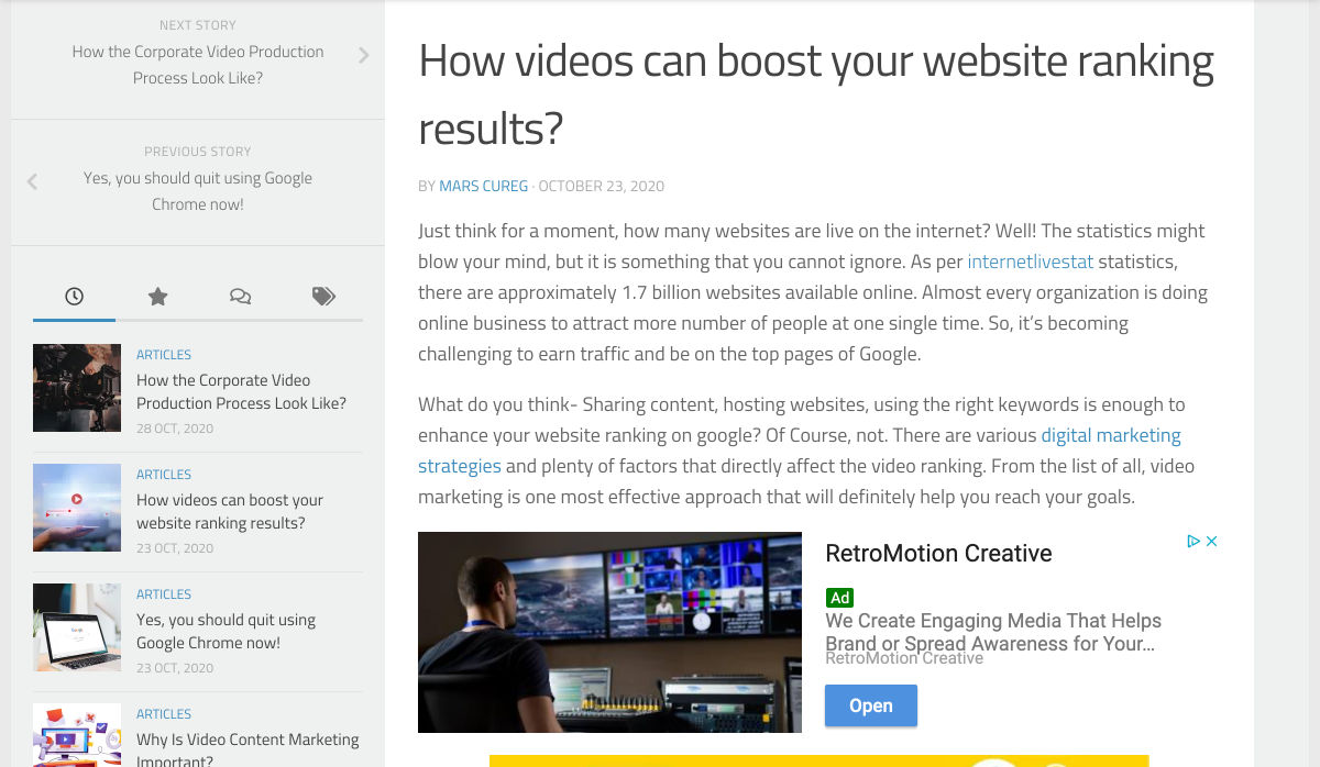
How Videos Can Boost your Website Ranking Results
5 Small Business Website Essentials You Need for your Site
The Psychology of User Decisions
Overflow for Windows – User Flow Diagramming Tool for Designers
How to Create an AI that Chats like You on WhatsApp
‘50 Shades of Blue’
Here’s Why Developers are in Love with Functional Programming
Apple Building Search Engine to Take on Google, Report Claims
A Faster Way to View Search Results with Less Clicking
Dark Mode in UI Design for Mobile Apps: Beauty Born in the Darkness
EncryptLab – A Collection of Free and Comprehensive Encryption Tools
Part of your World: Why We’re Proud to Build a Truly Native Mac App
Why I will not Call Myself a Junior Designer - and Neither Should You
10 Usability Mistakes Most Designers Make on Checkboxes
People Problems
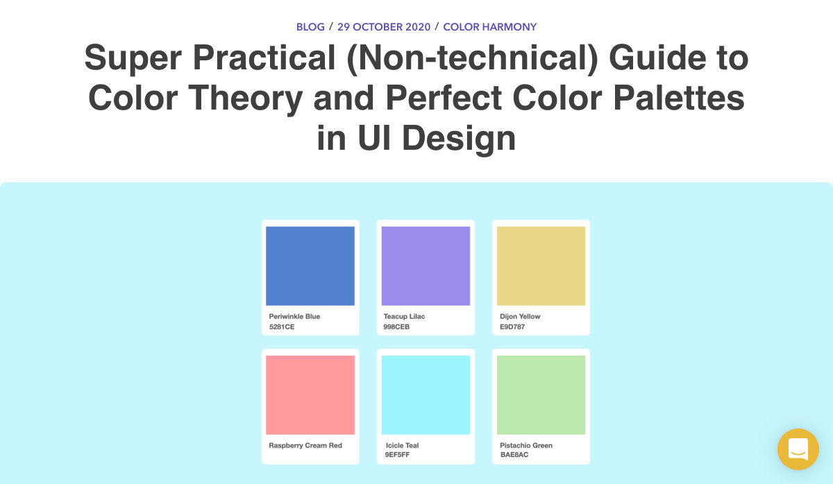
Practical Guide to Color Theory for UI Designers
Following the 2020 U.S. Election with Google
React Vs Svelte – A Comprehensive Comparison Between Javascript Libraries
Want more? No problem! Keep track of top design news from around the web with Webdesigner News. SourceThis content was first posted here: Popular Design News of the Week: October 26, 2020 – November 1, 2020 via Blogger Popular Design News of the Week: October 26, 2020 – November 1, 2020 
The best way to keep track of all the great stories and news being posted is simply to check out the Webdesigner News site, however, in case you missed some here’s a quick and useful compilation of the most popular designer news that we curated from the past week. Minimal CSS Frameworks
Responsive Grid Design: Ultimate Guide
The New Facebook Design Sucks
The No-Code Generation is Arriving
15+ Text Typing Effect CSS Animation Examples
AppSheet by Google Workspace – No-code App Building Platform
Ecommerce Development Trends: The 2021 Edition
How Videos Can Boost your Website Ranking Results
5 Small Business Website Essentials You Need for your Site
The Psychology of User Decisions
Overflow for Windows – User Flow Diagramming Tool for Designers
How to Create an AI that Chats like You on WhatsApp
‘50 Shades of Blue’
Here’s Why Developers are in Love with Functional Programming
Apple Building Search Engine to Take on Google, Report Claims
A Faster Way to View Search Results with Less Clicking
Dark Mode in UI Design for Mobile Apps: Beauty Born in the Darkness
EncryptLab – A Collection of Free and Comprehensive Encryption Tools
Part of your World: Why We’re Proud to Build a Truly Native Mac App
Why I will not Call Myself a Junior Designer - and Neither Should You
10 Usability Mistakes Most Designers Make on Checkboxes
People Problems
Practical Guide to Color Theory for UI Designers
Following the 2020 U.S. Election with Google
React Vs Svelte – A Comprehensive Comparison Between Javascript Libraries
Want more? No problem! Keep track of top design news from around the web with Webdesigner News. SourceThis content was first posted here: Popular Design News of the Week: October 26, 2020 – November 1, 2020 via Tumblr Popular Design News of the Week: October 26, 2020 – November 1, 2020
And that’s exactly what website developers (and designers!) are. They build up attractive, functional websites and apps for their clients. Yes, they work closely with clients, copywriters, vendors, and other professionals to get the job done, but the developers are the ones who put it all together. That’s why it’s critical that website developers are well-versed in marketing privacy laws — these regulations directly impact the end results of their work. But how does a website architect create a digital platform that honors both user privacy and the needs of their clients? What Privacy Laws Are Important For Web Developers?The two biggest privacy laws that web developers need to keep tabs on are the General Data Protection Regulations (GDPR) and the California Consumer Privacy Act (CCPA). Each law has its own unique scope and provisions, but they both shifted the landscape in defining an individual’s rights to their personal data and set mechanisms for how these rights would be protected and enforced. Each regulation also carries with it fines, fees, and legal measures for non-compliance. These can be substantial. And if that’s not enough, there’s an ever-increasing consumer demand for websites that prioritize privacy and security. Consider these statistics:
How Can Developers Implement These Laws?Privacy by Design is Critical for WebsitesUnder GDPR, web developers are required to adopt the Privacy by Design framework, which is a multi-point methodology intended to standardize data protection measures. Building privacy into websites shouldn’t happen at the end stages. It should start with how the websites are conceptualized in the first place. Here are points to prioritize:
Let’s look at these a little more closely… Data Minimization is the GoalData minimization is an important principle embedded in GDPR. Data minimization itself is a pretty straightforward concept: organizations should limit how much personal data they collect and only process the information necessary to accomplish their business purposes. Once the data is no longer useful, it should be deleted. For web developers, this means several things. When it comes to building websites, forms, cookies, and other methods should only ask for essential information. For example, if you are creating a pop-up to collect email addresses, don’t ask for their location unless it’s relevant to the email list and better serving their needs. How and Where Do You Introduce Privacy Policies and Notices?Let’s say you take data minimization seriously. That’s great! Now you need to put those data collection practices into words and share them with your customers. Privacy policies and notices are a big part of both GDPR and CCPA. Both the CCPA and the GDPR mandate that your privacy policy detail why you’re collecting information and how it will be used, as well as what the individual’s rights are and how they can exercise them. CCPA takes a slightly different angle, requiring privacy policies to disclose if the business sells personal data and what third parties have access to the data. CCPA also dictates that privacy policies and notices are current, updated at least annually. (Nota bene: GDPR also asks for updated privacy documents, but doesn’t specify frequency.) How does this translate from policy into web development?
Just-in-Time Notices for Transparency and TrustPart of Privacy by Design is the use of individual components of your website to create transparency and support compliance. From a development and design perspective, this means you should always be looking for ways to communicate the hows and whys of data collection. Yes, your privacy policies and notices aid in this, but going beyond these pieces is important. Customers recognize when businesses go the extra mile for them, after all. So consider implementing just-in-time notices at points where users enter their information. These notices are a chance to share your data collection practices with your users. It’s transparent! It’s open! It aids in consumer awareness! Keep Users in the LoopWant to win over your customers? Make it as easy as possible for them to manage their personal data and how it’s being used. This starts with making sure they are aware of why you’re requesting their information and how you’re planning on using it for the website. You should also:
One helpful tool for keeping users in the loop is a marketing preference center. A marketing preference center allows users easy access to their information. From there, they can manage, edit, and delete their information at their discretion. Bonus? A marketing preference center is an excellent point at which to communicate a business’ commitment to privacy. While users will pick up this through all the discrete elements of privacy on your website, putting it all into one hub that also allows users control over their data really reinforces this message. Remember, it’s not just on the consumer to manage their data. Web developers should commit to managing the data in their systems. This means they should:
Make it User FriendlyA final point: making your websites user friendly is important regardless of privacy compliance. Users expect websites that don’t make them think deeply about, or worry about, their privacy. Make it accessible and easy. Don’t make people figure it out on their own. Give them value for sharing their data Your users don’t have to share their data. They’re choosing to. So in exchange for their personal information, make sure you’re using it to provide a user-friendly website. Offer them a secure, enjoyable experience. But don’t ask for more than you need Let’s loop back around to this point again. While consumer data can help you build a better website, don’t plan your websites around it and don’t demand data to create a good experience. Usability, web design, and website security; all of these things benefit from consumer data. But privacy laws should always guide how any personal data is collected and used, and respect for consumers’ individual rights, and honoring their privacy should be top-of-mind for web developers.
Featured image via Pexels. SourceThis content was first posted here: Everything You Need to Know About Websites And Privacy Laws via Blogger Everything You Need to Know About Websites And Privacy Laws 
And that’s exactly what website developers (and designers!) are. They build up attractive, functional websites and apps for their clients. Yes, they work closely with clients, copywriters, vendors, and other professionals to get the job done, but the developers are the ones who put it all together. That’s why it’s critical that website developers are well-versed in marketing privacy laws — these regulations directly impact the end results of their work. But how does a website architect create a digital platform that honors both user privacy and the needs of their clients? What Privacy Laws Are Important For Web Developers?The two biggest privacy laws that web developers need to keep tabs on are the General Data Protection Regulations (GDPR) and the California Consumer Privacy Act (CCPA). Each law has its own unique scope and provisions, but they both shifted the landscape in defining an individual’s rights to their personal data and set mechanisms for how these rights would be protected and enforced. Each regulation also carries with it fines, fees, and legal measures for non-compliance. These can be substantial. And if that’s not enough, there’s an ever-increasing consumer demand for websites that prioritize privacy and security. Consider these statistics:
How Can Developers Implement These Laws?Privacy by Design is Critical for WebsitesUnder GDPR, web developers are required to adopt the Privacy by Design framework, which is a multi-point methodology intended to standardize data protection measures. Building privacy into websites shouldn’t happen at the end stages. It should start with how the websites are conceptualized in the first place. Here are points to prioritize:
Let’s look at these a little more closely… Data Minimization is the GoalData minimization is an important principle embedded in GDPR. Data minimization itself is a pretty straightforward concept: organizations should limit how much personal data they collect and only process the information necessary to accomplish their business purposes. Once the data is no longer useful, it should be deleted. For web developers, this means several things. When it comes to building websites, forms, cookies, and other methods should only ask for essential information. For example, if you are creating a pop-up to collect email addresses, don’t ask for their location unless it’s relevant to the email list and better serving their needs. How and Where Do You Introduce Privacy Policies and Notices?Let’s say you take data minimization seriously. That’s great! Now you need to put those data collection practices into words and share them with your customers. Privacy policies and notices are a big part of both GDPR and CCPA. Both the CCPA and the GDPR mandate that your privacy policy detail why you’re collecting information and how it will be used, as well as what the individual’s rights are and how they can exercise them. CCPA takes a slightly different angle, requiring privacy policies to disclose if the business sells personal data and what third parties have access to the data. CCPA also dictates that privacy policies and notices are current, updated at least annually. (Nota bene: GDPR also asks for updated privacy documents, but doesn’t specify frequency.) How does this translate from policy into web development?
Just-in-Time Notices for Transparency and TrustPart of Privacy by Design is the use of individual components of your website to create transparency and support compliance. From a development and design perspective, this means you should always be looking for ways to communicate the hows and whys of data collection. Yes, your privacy policies and notices aid in this, but going beyond these pieces is important. Customers recognize when businesses go the extra mile for them, after all. So consider implementing just-in-time notices at points where users enter their information. These notices are a chance to share your data collection practices with your users. It’s transparent! It’s open! It aids in consumer awareness! Keep Users in the LoopWant to win over your customers? Make it as easy as possible for them to manage their personal data and how it’s being used. This starts with making sure they are aware of why you’re requesting their information and how you’re planning on using it for the website. You should also:
One helpful tool for keeping users in the loop is a marketing preference center. A marketing preference center allows users easy access to their information. From there, they can manage, edit, and delete their information at their discretion. Bonus? A marketing preference center is an excellent point at which to communicate a business’ commitment to privacy. While users will pick up this through all the discrete elements of privacy on your website, putting it all into one hub that also allows users control over their data really reinforces this message. Remember, it’s not just on the consumer to manage their data. Web developers should commit to managing the data in their systems. This means they should:
Make it User FriendlyA final point: making your websites user friendly is important regardless of privacy compliance. Users expect websites that don’t make them think deeply about, or worry about, their privacy. Make it accessible and easy. Don’t make people figure it out on their own. Give them value for sharing their data Your users don’t have to share their data. They’re choosing to. So in exchange for their personal information, make sure you’re using it to provide a user-friendly website. Offer them a secure, enjoyable experience. But don’t ask for more than you need Let’s loop back around to this point again. While consumer data can help you build a better website, don’t plan your websites around it and don’t demand data to create a good experience. Usability, web design, and website security; all of these things benefit from consumer data. But privacy laws should always guide how any personal data is collected and used, and respect for consumers’ individual rights, and honoring their privacy should be top-of-mind for web developers. Featured image via Pexels. SourceThis content was first posted here: Everything You Need to Know About Websites And Privacy Laws via Tumblr Everything You Need to Know About Websites And Privacy Laws
Knowing effective SEO tricks would be incredibly profitable, but unfortunately it’s not that easy This becomes evident as soon as you do a Google search about anything SEO-related, only to find pages and more pages replete with blog posts and videos disclosing all the tips and tricks you “need to know” in order to achieve the best SEO results, in the fastest way possible. Knowing effective SEO tricks would be incredibly profitable, but unfortunately it’s not that easy. In its essence, SEO isn’t about hacks, shortcuts, and hidden optimizations, but rather about resource allocation. Keep reading to learn why! Be Careful About Over-Reliance on HacksBefore we start talking about resources, it’s important to understand why the quick and easy SEO hacks we’ve all read about online aren’t as reliable as they might seem. The reality is that yes, there are some traditional hacks and optimization tactics that many people swear by. However, SEO has become way too competitive for these hacks to still work. Think about it: anyone can learn about these hacks and shortcuts in a matter of seconds, which means that anyone can use them, which means that they’re not going to help your website stand out. By way of example, when thinking about keyword usage, many websites simply decide to put them everywhere on their website, without actually planning and strategizing. Perhaps years ago, doing so would lead to excellent results, but that’s not the case anymore. What I want to go over, and what I mean with this article, is that when developing your SEO plan, you should think less about hacks, and try to focus on strategy and resources instead. As tempting as they might be, most SEO hacks won’t really go that far. What does go far are those strategies and resource allocation decisions, which you can master as long as you know three things:
Base Your SEO Strategies on Your Business’s ResourcesSo, SEO is about resource allocation – we know that now…but what exactly does that mean? Well, this logic is based on something you might have heard of before, and that is the three pillars of SEO. As a refresher, everything in SEO revolves around three pillars:
Many businesses have a limited digital marketing budget and, as if that wasn’t enough, their SEO budget tends to be even more restricted. This means that we can’t try every hack out there or do every campaign we can come up with, hoping it will lead to positive results. On the contrary, it means we need to be methodical and understand which strategies have the most potential and are actually worth exploring. In summary, there’s one big challenge that every SEO team and company experiences, and that is the limitation of resources versus possible operations, and that leads us to a question: what mix of SEO pillars will give us a good shot at ranking high and surpassing our competitors? Develop Your SEO Strategies Based on Your Inherent StrengthsThe mistake that a lot of business owners make after reading SEO articles or hearing about amazing case studies is that they try and copy the strategies they learned about, from beginning to end. However, contextually, each case study or article could refer to a strategy that was specifically optimized for a different type of business. So, although copying what other successful businesses can work in certain situations when speaking about SEO, it’s best to borrow ideas and use the ones that fit your inherent strengths. Based on the pillars of SEO that we discussed earlier, there are three strong points that a company can have: If You Have a Strong Network…Some businesses don’t have the resources to create an in-house content development team or outsource writing services. However, they have another strong suit, which lies in their ability to go out into their community, speak, and be heard. They can do this because they have built a strong network over the years and, in cases like this, what we often do is use a backlinking approach. When working with businesses that have a strong community presence, go out and double down on their network. Pitch their relevant contacts for guest speakership and guest posts, building thought leadership, while also driving links to their website. If You’re Not That Popular But Are Good With Words…Right now, some of you might be thinking: “Yeah, well, that’s easy when you’ve built the exposure, but not all of us are lucky enough to be well-known”. Listen, I get it, we’ve all been in that position. For clients and businesses that feel like they don’t have the brand equity or exposure to develop a strong backlinking strategy, opt for another route, and invest much more on content (and/or technical SEO, see below). If the client has a team who’s ready to put its head down and get to work, then focus on producing a lot of content for their website. Ultimately, the goal is to build a content library that is thorough and expansive, and that provides the client with more opportunities for keyword rankings, while also reinforcing the relevance of their website for those specific SEO keywords. If Technical Knowledge is Your Forte…You may not like (or have time) to write and you may not have a strong community presence, but if you have advanced technical skills and the ability to create a strong website quickly, then there’s another approach you can take. This leads us into the third pillar of SEO: technical SEO. This solution is indicated for technical teams that can create large websites, databases and user experiences in no time, and it is typically adopted by tech startups that are trying to create an app that provides user value. First and foremost, winning at technical SEO requires strong technical skills that will allow you to build the web assets that you need, but that’s not all. It also requires you to understand how you can double down on these skills and manage large websites in the rather complex Google ecosystem. So you need, for example, to know how you can get Google to notice and properly index the new pages you create on your website, even if you already have 100,000 pre-existing pages. Or to ensure that each of your new pages is properly optimized for the best keywords. Needless to say, using technical SEO does become a complex operation. However, when done right, it can lead your SEO to grow by sheer size, with the hopes that certain relevant keywords will start to rank for your business naturally. Conclusion: Your Strategy Will Probably Be a Combination of the Three PillarsWhen it comes to SEO, honing in on your strengths and accepting the fact that you can’t do everything is definitely the way to go. When you’re running an SEO campaign, you should always focus on what you’re good at, know your resources, and augment what you already master – and that will put you in the right direction. By focusing your resources on any of the pillars of SEO (or even a mix of them), you substantially increase your chances of achieving long-term success, which will not happen if you go for hacks and shortcuts instead. A long-term, highly-organized, resource-allocated SEO strategy won’t only guarantee continuous success, but it can ultimately become self-sustaining, meaning that it will allow you to keep growing and growing, becoming an organic part of your marketing plan. I’ve seen a lot of people try SEO hacks for two weeks, only to realize that they didn’t work and that their efforts had been in vain. It’s unfortunate because by doing so, you’re turning your back on a marketing channel that is very valuable to a lot of people, and these hacks trick people into thinking it’ll be overnight. So remember, resource allocation over hacks and shortcuts! SourceThis content was first posted here: You Won’t Win SEO With Hacks, Here Are 3 Winning SEO Strategies via Blogger You Won’t Win SEO With Hacks, Here Are 3 Winning SEO Strategies 
Knowing effective SEO tricks would be incredibly profitable, but unfortunately it’s not that easy This becomes evident as soon as you do a Google search about anything SEO-related, only to find pages and more pages replete with blog posts and videos disclosing all the tips and tricks you “need to know” in order to achieve the best SEO results, in the fastest way possible. Knowing effective SEO tricks would be incredibly profitable, but unfortunately it’s not that easy. In its essence, SEO isn’t about hacks, shortcuts, and hidden optimizations, but rather about resource allocation. Keep reading to learn why! Be Careful About Over-Reliance on HacksBefore we start talking about resources, it’s important to understand why the quick and easy SEO hacks we’ve all read about online aren’t as reliable as they might seem. The reality is that yes, there are some traditional hacks and optimization tactics that many people swear by. However, SEO has become way too competitive for these hacks to still work. Think about it: anyone can learn about these hacks and shortcuts in a matter of seconds, which means that anyone can use them, which means that they’re not going to help your website stand out. By way of example, when thinking about keyword usage, many websites simply decide to put them everywhere on their website, without actually planning and strategizing. Perhaps years ago, doing so would lead to excellent results, but that’s not the case anymore. What I want to go over, and what I mean with this article, is that when developing your SEO plan, you should think less about hacks, and try to focus on strategy and resources instead. As tempting as they might be, most SEO hacks won’t really go that far. What does go far are those strategies and resource allocation decisions, which you can master as long as you know three things:
Base Your SEO Strategies on Your Business’s ResourcesSo, SEO is about resource allocation – we know that now…but what exactly does that mean? Well, this logic is based on something you might have heard of before, and that is the three pillars of SEO. As a refresher, everything in SEO revolves around three pillars:
Many businesses have a limited digital marketing budget and, as if that wasn’t enough, their SEO budget tends to be even more restricted. This means that we can’t try every hack out there or do every campaign we can come up with, hoping it will lead to positive results. On the contrary, it means we need to be methodical and understand which strategies have the most potential and are actually worth exploring. In summary, there’s one big challenge that every SEO team and company experiences, and that is the limitation of resources versus possible operations, and that leads us to a question: what mix of SEO pillars will give us a good shot at ranking high and surpassing our competitors? Develop Your SEO Strategies Based on Your Inherent StrengthsThe mistake that a lot of business owners make after reading SEO articles or hearing about amazing case studies is that they try and copy the strategies they learned about, from beginning to end. However, contextually, each case study or article could refer to a strategy that was specifically optimized for a different type of business. So, although copying what other successful businesses can work in certain situations when speaking about SEO, it’s best to borrow ideas and use the ones that fit your inherent strengths. Based on the pillars of SEO that we discussed earlier, there are three strong points that a company can have: If You Have a Strong Network…Some businesses don’t have the resources to create an in-house content development team or outsource writing services. However, they have another strong suit, which lies in their ability to go out into their community, speak, and be heard. They can do this because they have built a strong network over the years and, in cases like this, what we often do is use a backlinking approach. When working with businesses that have a strong community presence, go out and double down on their network. Pitch their relevant contacts for guest speakership and guest posts, building thought leadership, while also driving links to their website. If You’re Not That Popular But Are Good With Words…Right now, some of you might be thinking: “Yeah, well, that’s easy when you’ve built the exposure, but not all of us are lucky enough to be well-known”. Listen, I get it, we’ve all been in that position. For clients and businesses that feel like they don’t have the brand equity or exposure to develop a strong backlinking strategy, opt for another route, and invest much more on content (and/or technical SEO, see below). If the client has a team who’s ready to put its head down and get to work, then focus on producing a lot of content for their website. Ultimately, the goal is to build a content library that is thorough and expansive, and that provides the client with more opportunities for keyword rankings, while also reinforcing the relevance of their website for those specific SEO keywords. If Technical Knowledge is Your Forte…You may not like (or have time) to write and you may not have a strong community presence, but if you have advanced technical skills and the ability to create a strong website quickly, then there’s another approach you can take. This leads us into the third pillar of SEO: technical SEO. This solution is indicated for technical teams that can create large websites, databases and user experiences in no time, and it is typically adopted by tech startups that are trying to create an app that provides user value. First and foremost, winning at technical SEO requires strong technical skills that will allow you to build the web assets that you need, but that’s not all. It also requires you to understand how you can double down on these skills and manage large websites in the rather complex Google ecosystem. So you need, for example, to know how you can get Google to notice and properly index the new pages you create on your website, even if you already have 100,000 pre-existing pages. Or to ensure that each of your new pages is properly optimized for the best keywords. Needless to say, using technical SEO does become a complex operation. However, when done right, it can lead your SEO to grow by sheer size, with the hopes that certain relevant keywords will start to rank for your business naturally. Conclusion: Your Strategy Will Probably Be a Combination of the Three PillarsWhen it comes to SEO, honing in on your strengths and accepting the fact that you can’t do everything is definitely the way to go. When you’re running an SEO campaign, you should always focus on what you’re good at, know your resources, and augment what you already master – and that will put you in the right direction. By focusing your resources on any of the pillars of SEO (or even a mix of them), you substantially increase your chances of achieving long-term success, which will not happen if you go for hacks and shortcuts instead. A long-term, highly-organized, resource-allocated SEO strategy won’t only guarantee continuous success, but it can ultimately become self-sustaining, meaning that it will allow you to keep growing and growing, becoming an organic part of your marketing plan. I’ve seen a lot of people try SEO hacks for two weeks, only to realize that they didn’t work and that their efforts had been in vain. It’s unfortunate because by doing so, you’re turning your back on a marketing channel that is very valuable to a lot of people, and these hacks trick people into thinking it’ll be overnight. So remember, resource allocation over hacks and shortcuts! SourceThis content was first posted here: You Won’t Win SEO With Hacks, Here Are 3 Winning SEO Strategies via Tumblr You Won’t Win SEO With Hacks, Here Are 3 Winning SEO Strategies |


 There are so many things to think about when first starting a business. What will your business offer? How will this differ from existing solutions? Who will benefit most from your offering? And why are you so passionate about this?


 As we turn the corner into the final part of the year, many of the new websites and redesigns that we see during much of the rest of the year tend to slow down. Many businesses are focusing on fourth quarter and holiday sales.
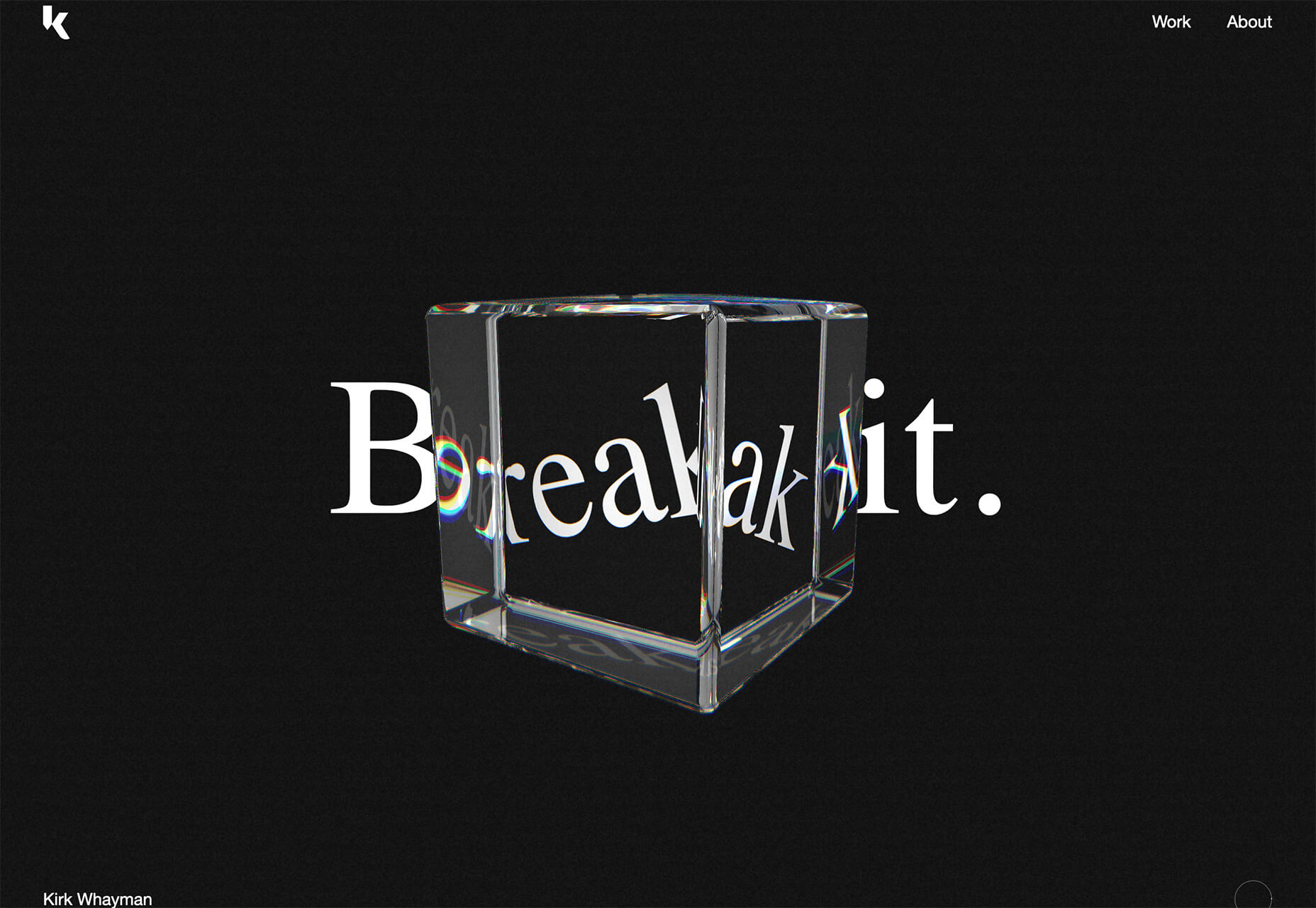


 Every week users submit a lot of interesting stuff on our sister site Webdesigner News, highlighting great content from around the web that can be of interest to web designers.
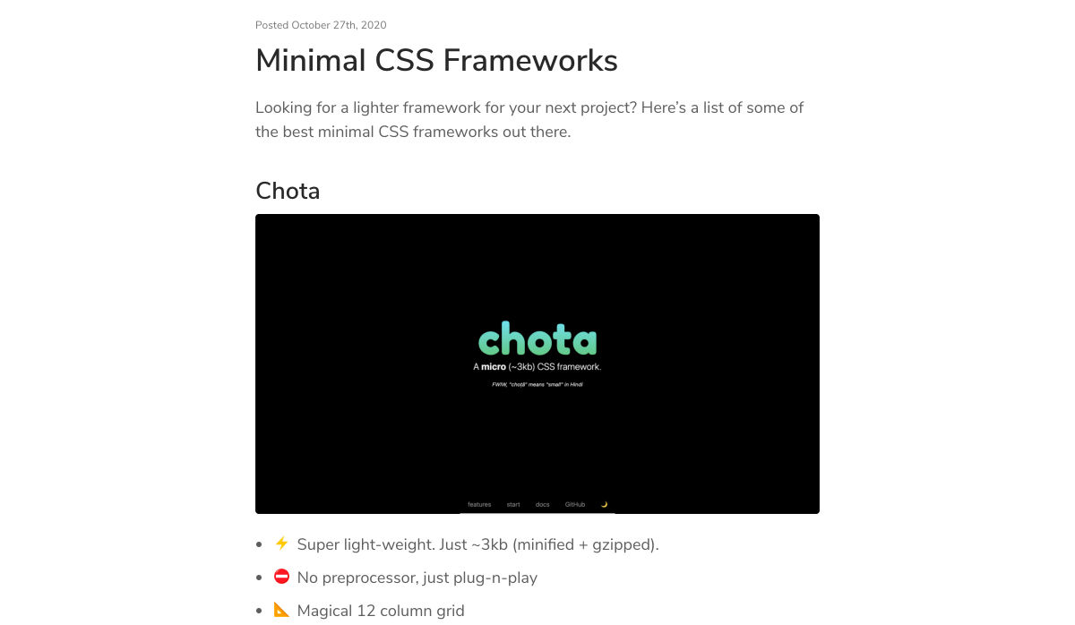


 When it comes to compliance, website developers need to keep their eyes on more than just ADA regulations and Section 508. Privacy laws are a big consideration and decisions on how to build privacy into a website start with architects.
  The world of search engine optimization was born with all sorts of different hacks and shortcuts that many people use in an effort to grow their business.
 RSS Feed
